Graphs and Charts For Your Blog Posts: 7 Simple + Powerful Sources

Visuals have a powerful role in content.
You’ve heard people say it’s valuable to add visuals to your blog posts because they add dynamics to a lot of text or help with keeping your reader’s attention.
There’s truth to that, but I want to focus on visuals—graphs and charts in particular—from a slightly different perspective:
Graphs and charts help your readers understand data quickly. It brings clarity in an instant. It shows relationships or patterns within a topic.
As I’ve been working with software companies on their content, I’ve quickly learned how valuable it is to paint a picture using graphs and charts. I know it’s a powerful tool in content creation, so in this guide, I’m showing you my favorite techniques and tools to add visualized data to your content.
A few precautionary notes:
- If the data you find doesn’t support your point of view, don’t manipulate it to do so (including removing it from its context to alter its meaning).
- Always credit your source.
- If the data is more than a couple of years old, but it’s still relevant, say so! There’s nothing worse than painting a 2013 statistic as ‘current’ and pretending no one will find out it’s not from this year. If it’s truly outdated, don’t use it.
- Check out this article on the science of charts and take the quiz that demonstrates human perception of charts. It’s eye-opening!
- Only add graphs, charts, and even textual data if it truly aligns with what you hope to convey and adds to the big picture of your post. Don’t add it just because a marketer said you should.
Ready? Let’s go.
1. Industry reports
My favorite place to look first is the household names of the industry I’m writing about.
As I’m often looking for marketing and ecommerce insights, I typically go to:
This is where I’ll find either insights from original research, or curated graphs and statistics.
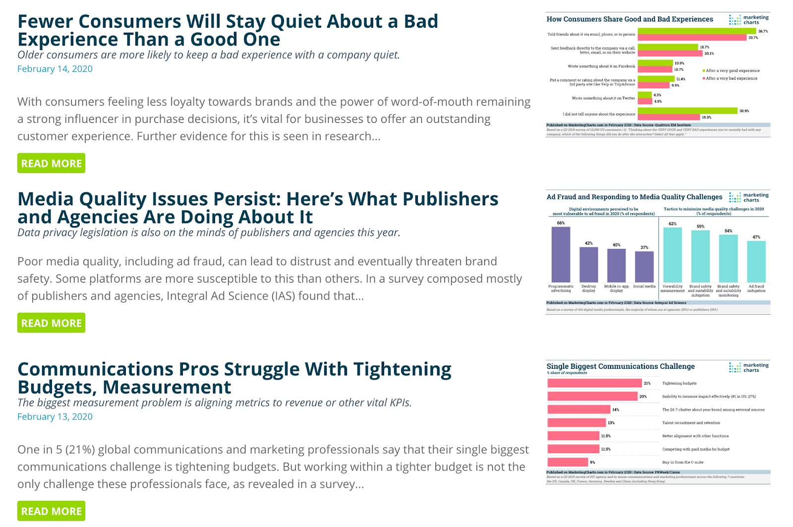
Build your own list of such resources for the industry and audience you’re writing for. It may take you a while, but it will then become your go-to source of powerful data to use.
Most of these publications have a search bar so you can look for exactly what you need, too!
2. “State of [industry]” reports
This is a goldmine. I first learned about these types of reports a few years ago when I started referencing HubSpot’s State of Inbound report. Then, I learned about Buffer’s State of Remote Work… And a new world was available.

Do a Google search for the state of your industry/topic—simple as that!
Here are just a few reports I’ve found after a few quick searches:
- State of marketing automation
- State of customer success
- State of customer engagement
- State of the financial services industry
- State of customer service
- State of sales
- State of employee benefits
3. “[Topic] statistics” image search
Head to Google, search for your topic + statistics, and click on the Images tab.
That’s it.
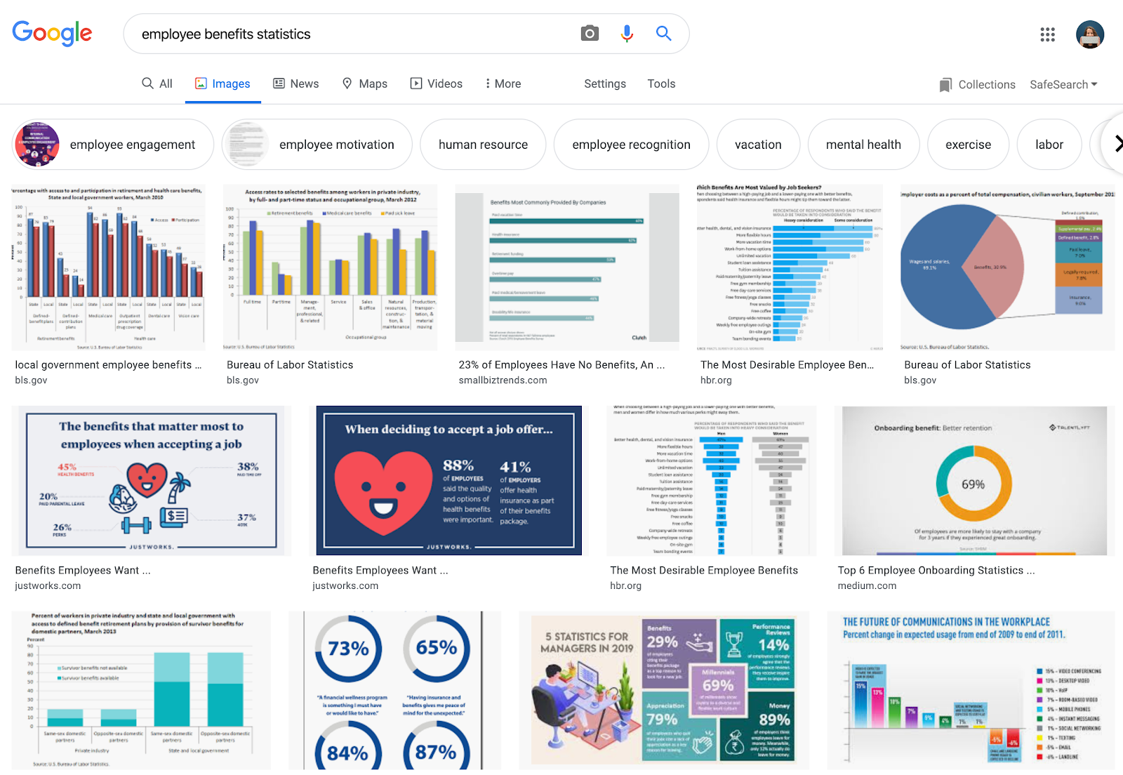
Of course, don’t just grab an image and run with it. Click through to the page, look at the actual data, and decide if it’s the right thing to include in your post.
You can also further filter these results using the suggestions at the top. As you can see in the screenshot above, you can look at specific statistics on mental health within employee benefits.
4. Statista
Statista doesn’t need a lot of introduction. Often times, even just by searching for “[your topic] statistics,” Statista will be one of the top results.
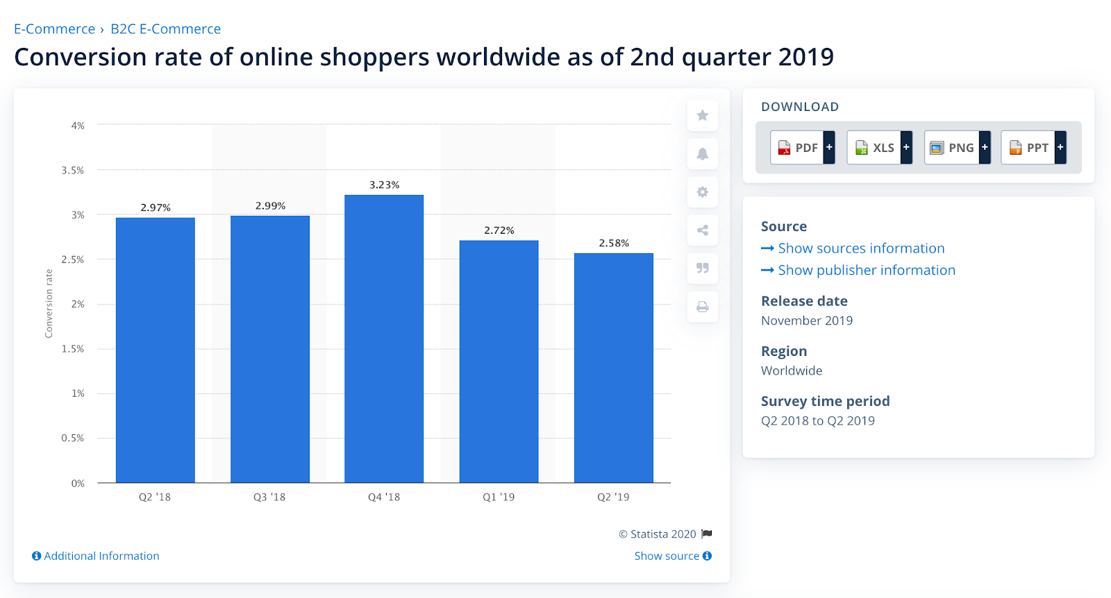
For me, it’s been especially helpful with certain marketing and shopping insights, as well as for data specific to regions. It often provides some of the most current data on a topic—as recent as a few months ago!
A word of warning: often times, graphs you really want to see are behind a paywall, and sometimes you just get locked out because you’ve viewed too many free graphs, so be intentional when searching. A premium Statista account starts at $59/month.
5. Grafiti.io
Grafiti is a search engine for charts, graphs, and infographics. It’s as simple as typing in your term into their search bar. If you add quotation marks, it will search for the exact phrase.
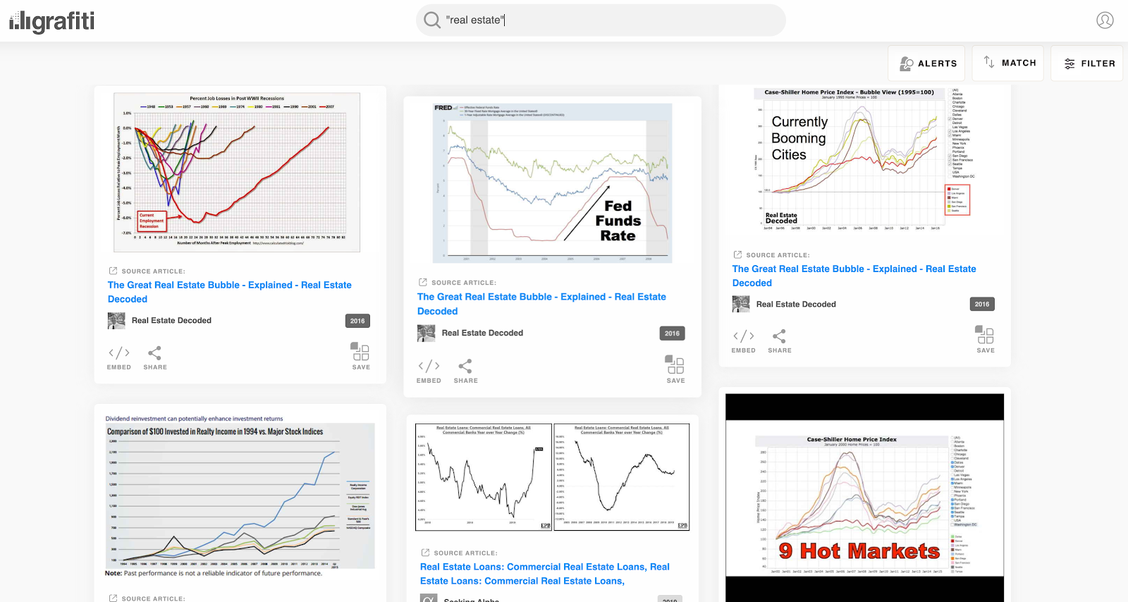
They claim to manually review every source they get, and update them daily. It can be a really great addition to your search for the best data visualizations for your content.
6. Our World in Data
If you’re looking for data on larger problems than just the examples I’ve shown above, you’ll love Our World in Data.
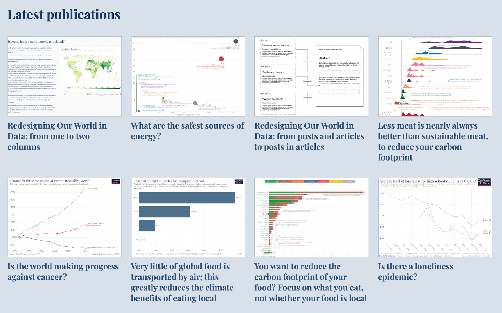
Their data includes topics such as quality of education, air pollution, renewable energy, technology adoption, economic inequality, life satisfaction, human rights, mental health, and so much more.
(This is also a great place to go if you just want to learn about our world in general.)
7. Build your own graphs and charts
If you have data points or trends you’d like to visualize, here are a few ideas to do so.
First is using Google Trends. Here’s a simple example: how popular have email marketing, social media marketing, and affiliate marketing been for the past decade?
Here’s how Google Trends visualizes it:
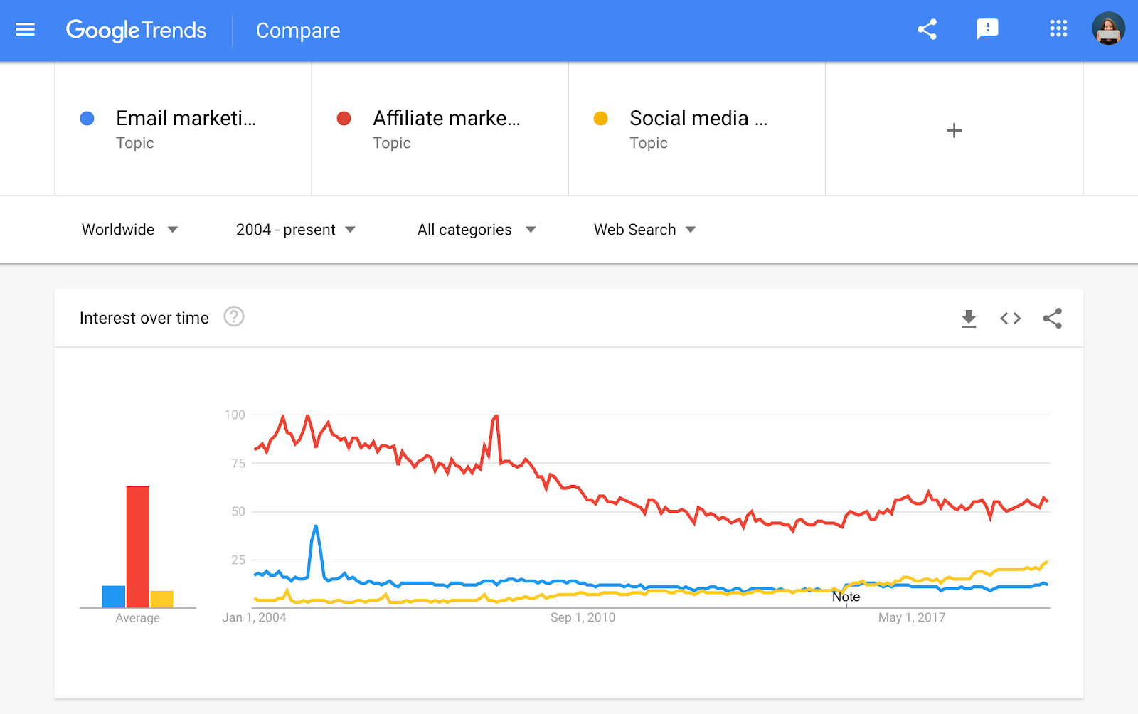
You can also do this for specific search terms, types of search, locations, and time ranges.
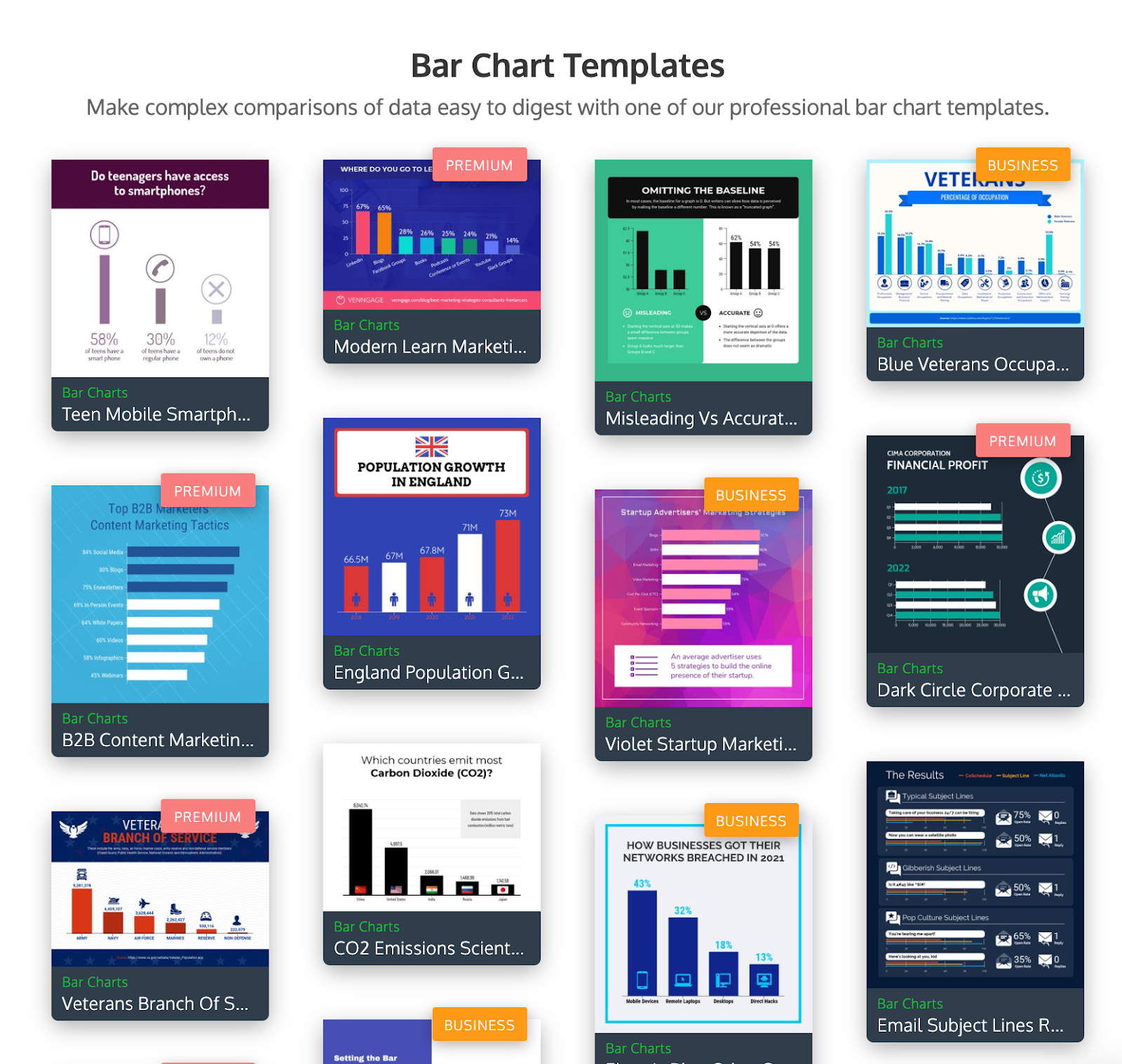
If you have specific numbers you’d like to create a graph from, a tool like Venngage is a great option.
It’s an infographic maker, and they have a specific category of chart templates. These can be as simple as bar charts with numbers/percentages, which can highlight your key data in a powerful way.
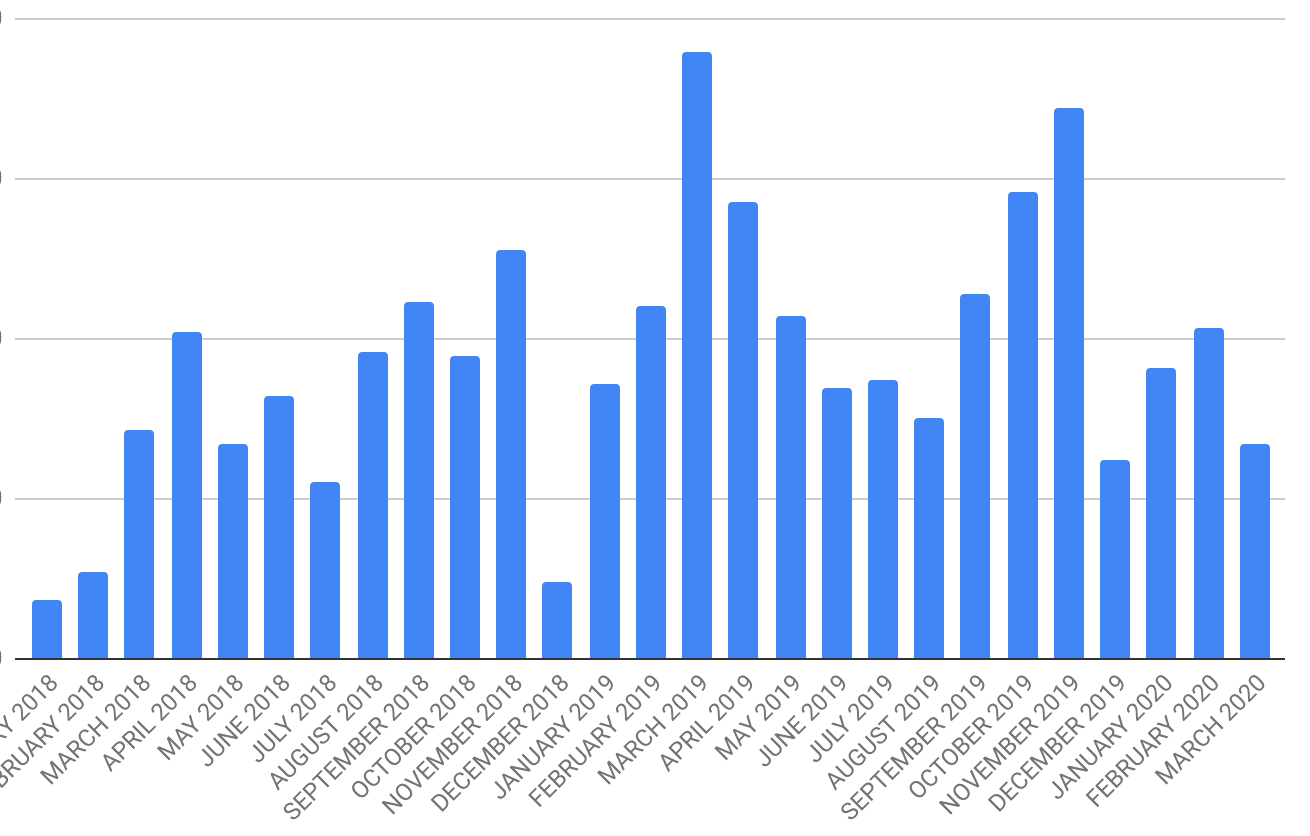
Finally, you can turn a lot of data in your Google Sheets into a simple graph. In your document, click Insert > Chart, and let Google Sheets guide you through the process. You’ll see an intuitive chart editor on the right hand side that will let you edit your data range, labels, chart types, colors, and more.
Here’s an example from my own Google Sheets, which visualizes my freelance income over the last 2 years (specific numbers are omitted on purpose, but they’re easy to add, too):
Pick a source and get started
I hope you feel inspired to visualize the right data in the right way so that your blog posts hit the goals you’ve set for them.
Have you already used some of the sources I’ve listed? Are you using any other ways to add graphs and charts? Be sure to tweet me or comment below to let me know!
PS Pin this post so that you can easily refer to it later:

